I was unsure what to do for the 2021 Zine Quest, and I wrote last time how my fantasy RPG, Heralds, was approaching a point where the project was too big to fit comfortably into the Zine Quest format. I could have cut it back, but I like the systems, and I felt it would lose too much if it was cut shorter. I bit the bullet and did what any self-respecting Zine Questee would do, I decided to write a different game.
In fairness I had the core of the system already written up, so I wasn’t coming at it from nothing. I knew the genres and themes I wanted to hit, they were baked into the system I had dusted off. So what did I do?
First, I made a few more notes, and left it at that for a week.
In that week I did three things before really delving into the system, setting, and writing. I worked on finding an artist whose style matched my feel for the setting and game, I looked for fonts that would work in a similar vein, and I started developing the layout and look of the zine.
Normally I tend to get writing first, so this was a departure from the established routine for me. Why did I go this route? To be honest, it was the fact that while I had a feel for the game in terms of what I wanted out of the mechanisms and setting, the setting itself was nebulous, it was feelings and emotion, a pace and rhythm, a soundtrack with no lyrics. I felt that getting a good grip on the visuals of the game would help me ground the the rules and setting, provide inspiration and limitation in equal and needed quantities. I’m glad I did.
I found an artist I am really excited to be working with, I won’t say too much just yet (not until there is something to show alongside), but I will say that I think his work is going to make Rascals look absolutely brilliant.
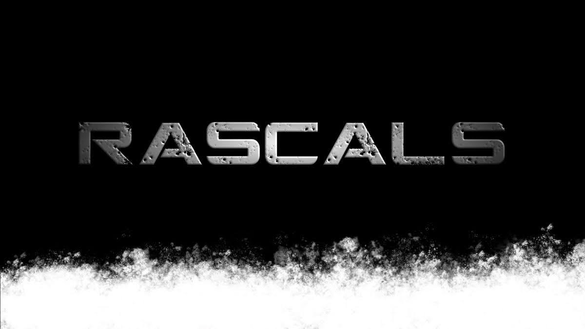
I started working on the layout. With Corsairs the game was originally envisaged to be more of a old-time worn look, faded leather and the like. With Rascals I wanted to make something stridently black and white, something that would fit within the two-tone rules for Zine Quest, and really sit comfortably within that space. I am really happy with how Rascals is looking at the moment, and I think once the art is dropped in, it will really look amazing.
Lastly I looked at fonts… and well. That’s a whole thing. Finding fonts that fit the style you want, but making sure that they are free for commercial use (or that you can get hold of a license for them), is not as easy as it could be. A lot of the fonts that come with Word or whatever program you happen to use might be free for personal use, but not for commercial use. I looked through a whole slew of fonts before settling on two I really liked. One will be used for all the headings, and the other for the body text. The 3D and gradient overlay effects for the title and contents pages were all done in Affinity, and fit the theme and game perfectly in my opinion.
So, a little update on where I am at in the lead up to Zine Quest 2021. I will be back with more on the subject, and back with some reflections on the year past (and hopes for the year ahead) in another post.
Where-ever you are, I hope you and yours had a lovely Christmas/Holiday period (if you celebrate such things), and a smashing new year (again…).
This article is a part of a series about running a Kickstarter campaign for Zine Quest, you can find the other articles in this series here.